Einbahnstraße
Illustrated Book, 2020
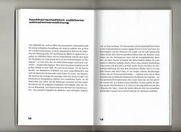
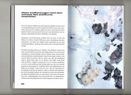
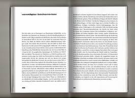
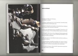
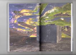
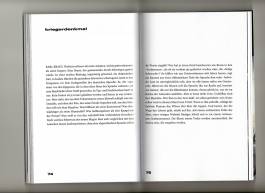
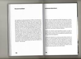
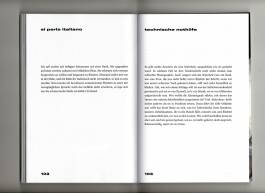
In this redesign of Walter Benjamin‘s “one-way street” the fragmentary texts with different themes and lengths are shown on 124 pages with 10 illustrations. In order to enable intensive reading of the demanding texts, the typographical design of the book emphasizes clarity and a lot of white space. The text is set in a modern baroque antiqua, which is characterized by evenness and harmony and is perfectly legible in justification. The bold, left-aligned headline and pagina frame the text. Inspired by the philosophy of the flaneur, the illustrations evoke a surreal world made up of textures, colours and shapes. Materials and objects that appear in the texts are put together to form a new whole. The stylistic devices of the texts are reflected in the design of the pictures. In this way, Benjamin's way of thinking, as well as the fragmentary form and the puzzled arrangement of the small prose pieces become visible through the digital photo montages. The front cover consists of the title and autor framed by rounded rectangles that are inspired by traffic signs. The back cover gives a brief insight into the autors life since it is essential to understand the short texts better.
This project was created as part of the master’s course at the Mainz University of Applied Sciences and in cooperation with the Büchergilde Gutenberg.
Softcover, 13 x 19 cm, 90 g Offset white
